By Ryan Murphy
Appalachian Voices’ online communications intern, Summer 2014

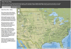
The EPA’s interactive “Where You Live” tool summarizes climate change impacts and state actions to limit greenhouse gas emissions.
The U.S. Environmental Protection Agency’s recently announced Clean Power Plan aims to cut carbon pollution from power plants nationwide. Specifically, the plan seeks to cut carbon emissions by 30 percent from 2005 levels. A new tool on the EPA’s website allows users to see how their state will be affected by the federal effort.
The tool is a clickable map that shows a particular state’s carbon emissions in millions of metric tons and the percentage of those emissions which came from fossil fuel-fired power plants. This is calculated into an emission rate that is expressed as “pounds per megawatt hours.” The EPA’s tool presents its yearly emissions calculations as such:
1. Millions of metric tons of carbon emitted by the state
2. Amount of energy produced by the state (presented in terawatt hours, each of which is equal to one million megawatt hours)
3. A combination of the two previous factors (pounds per megawatt hours): This demonstrates how many pounds of carbon are emitted for every megawatt hour of energy produced by a power plant, or how much carbon dioxide is released to meet that state’s energy demand.
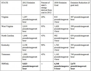
The table below shows 2012 emissions levels of five central and southern Appalachian states and the amount of carbon pollution those states will need to cut under EPA’s proposed plan.

A table of carbon emissions and coal’s share of electricity generation in five central and southern Appalachian states. Click to enlarge.
What accounts for the differences in emissions? For example, Virginia released 861 fewer pounds of CO2 per megawatt hour than Kentucky in 2012.
That’s where another feature of this tool comes in: each state’s profile features a pie graph of different energy sources and their share of a state’s overall generation.
Kentucky derived an enormous 92 percent of its energy from coal in 2012. Virginia derived only 20 percent of its energy from coal. The majority of the Old Dominion’s energy comes from nuclear (40 percent) and, a close second, natural gas (35 percent).
Burning coal releases more carbon than any other energy source, so it makes sense that those states which use the highest percentages of coal also release the highest amount of carbon.
This carbon dioxide accumulates in the atmosphere and aggravates climate change. A significant reduction in these emissions seeks not only to mitigate climate change but also to reduce pollutants that can cause asthma and other health problems.
Each state must develop a plan to meet these lower carbon emission goals. In an ideal world, these states would make a seamless transition to cleaner forms of energy. They could remain energy-based economies by becoming clean energy-based economies.
It remains to be seen how the coal industry’s influence will affect the implementation of this rule by Appalachian states. But considering the fact that as much as 95 percent of a single state’s energy can come from coal, the EPA’s plan could have a significant effect on Appalachia as states are given federal impetus to curtail carbon emissions, and, implicitly, coal consumption.


Leave a Reply